Programming/Kdb/Labs/Exploratory data analysis
Getting hold of data
In this lab we'll make sense of the following data set from the UCI Machine Learning Repository:
- Name: Real estate valuation data set
- Data Set Characteristics: Multivariate
- Attribute Characteristics: Integer, Real
- Associated Tasks: Regression
- Number of Instances: 414
- Number of Attributes: 7
- Missing Values? N/A
- Area: Business
- Date Donated: 2018.08.18
- Number of Web Hits: 111,613
- Original Owner and Donor: Prof. I-Cheng Yeh, Department of Civil Engineering, Tamkang University, Taiwan
- Relevant papers:
- Yeh, I.C., and Hsu, T.K. (2018). Building real estate valuation models with comparative approach through case-based reasoning. Applied Soft Computing, 65, 260-271.
There are many data sets on UCI that are worth exploring. We picked this one because it is relatively straightforward and clean.
Let's read the data set information:
The market historical data set of real estate valuation is collected from Sindian Dist., New Taipei City, Taiwan. The real estate valuation is a regression problem. The data set was randomly split into the training data set (2/3 samples) and the testing data set (1/3 samples).
This paragraph describes how the original researchers split up the data set. We will split it up differently: fifty-fifty.
Let's read on:
The inputs are as follows:
- X1 = the transaction date (for example, 2013.25=2013 March, 2013.500=2013 June, etc.)
- X2 = the house age (unit: year)
- X3 = the distance to the nearest MRT station (unit: metre)
- X4 = the number of convenience stores in the living circle on foot (integer)
- X5 = the geographic coordinate, latitude (unit: degree)
- X6 = the geographic coordinate, longitude (unit: degree)
The output is as follows:
- Y = house price per unit area (10000 New Taiwan Dollar/Ping, where Ping is a local unit, 1 Ping = 3.3 square metres)
Downloading the data set and converting it to CSV
The data set can be downloaded from the data folder https://archive.ics.uci.edu/ml/machine-learning-databases/00477/. The data is supplied in the form of an excel file, Real estate valuation data set.xlsx. In order to export this data to kdb+/q, we convert it to the comma-separated values (CSV) format:
- start Excel;
- File > Open the file Real estate valuation data set.xlsx;
- File > Save As, set "Save as type" to "CSV (Comma delimited)", click "Save".
Opening the data set in kdb+/q
We read in the resulting CSV file as a kdb+/q table:
t:("HFFFHFFF";enlist",")0:`$":S:/dev/bodleian/teaching/kdb-q/Real estate valuation data set.csv"
(Here you need to replace our path with the corresponding path on your machine.)
We have specified the type for each column as "HFFFHFFF". Here "H" stands for short and "F" stands for float.
We can examine the meta data for the resulting table with
meta t
The result:
c                                     | t f a
--------------------------------------| -----
No                                    | h
X1 transaction date                   | f
X2 house age                          | f
X3 distance to the nearest MRT station| f
X4 number of convenience stores       | h
X5 latitude                           | f
X6 longitude                          | f
Y house price of unit area            | f
It's somewhat inconvenient to work in q with table column names containing spaces, so we rename the columns as follows:
t:`no`transaction_date`house_age`distance_to_nearest_mrt`number_of_convenience_stores`latitude`longitude`house_price_per_unit_area xcol t
We check the meta data again:
meta t
The result:
c                           | t f a
----------------------------| -----
no                          | h
transaction_date            | f
house_age                   | f
distance_to_nearest_mrt     | f
number_of_convenience_stores| h
latitude                    | f
longitude                   | f
house_price_per_unit_area   | f
Producing the time series plot of house_price_per_unit_area
We look at the first 10 rows
select[10] from t
no transaction_date house_age distance_to_nearest_mrt number_of_convenience_s..
-----------------------------------------------------------------------------..
1  2012.917         32        84.87882                10                     ..
2  2012.917         19.5      306.5947                9                      ..
3  2013.583         13.3      561.9845                5                      ..
4  2013.5           13.3      561.9845                5                      ..
5  2012.833         5         390.5684                5                      ..
6  2012.667         7.1       2175.03                 3                      ..
7  2012.667         34.5      623.4731                7                      ..
8  2013.417         20.3      287.6025                6                      ..
9  2013.5           31.7      5512.038                1                      ..
10 2013.417         17.9      1783.18                 3                      ..
and observe that the data is not sorted by transaction_date. We therefore sort it by transaction_date (in-place, hence `t and not t in the following command):
`transaction_date xasc `t
meta t reveals that the data is now sorted by transaction_date:
meta t
c                           | t f a
----------------------------| -----
no                          | h
transaction_date            | f   s
house_age                   | f
distance_to_nearest_mrt     | f
number_of_convenience_stores| h
latitude                    | f
longitude                   | f
house_price_per_unit_area   | f
We see that the transaction_date now has the "sorted" (s) attribute (a).
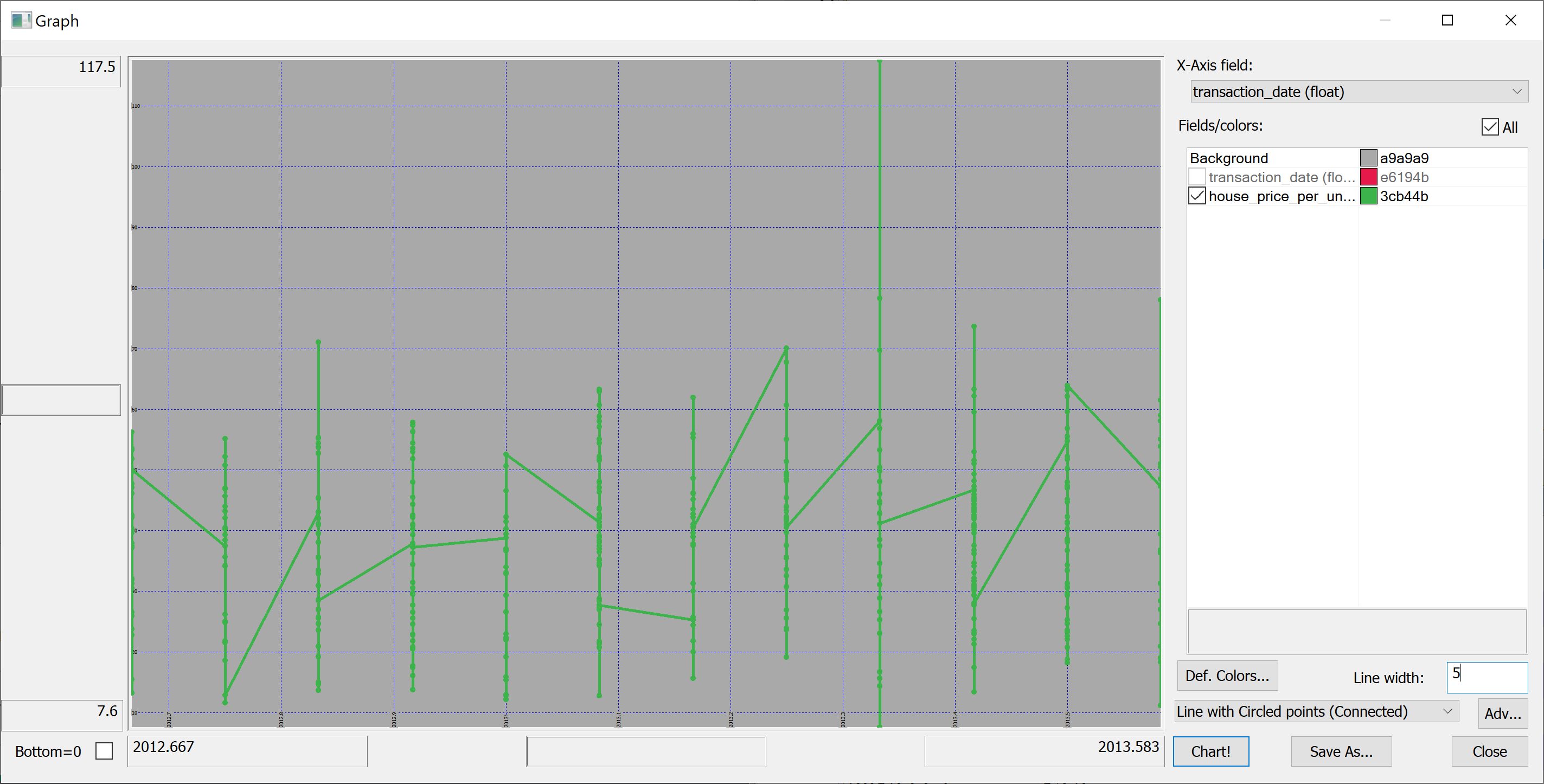
Here is our first attempt to produce a time series plot of house_price_per_unit_area:
select transaction_date, house_price_per_unit_area from t
The resulting plot is confusing because the transaction_date is bucketed into (floating point) months:
(Here we have used Q Insight Pad to plot the results of a q-sql query.)
Can we do better?
Perhaps we could build something on the basis of
select house_price_per_unit_area by transaction_date from t
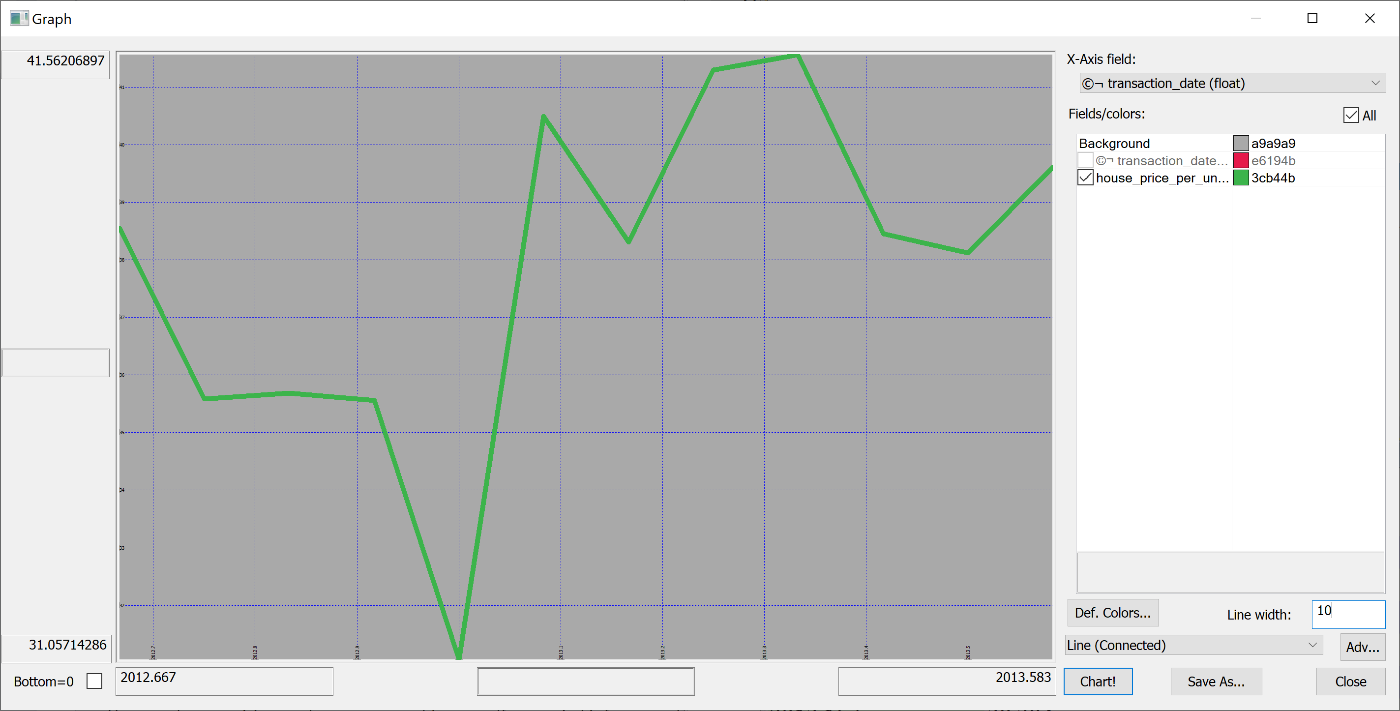
We could produce the plot of the mean house_price_per_unit_area in any given month:
select avg house_price_per_unit_area by transaction_date from t
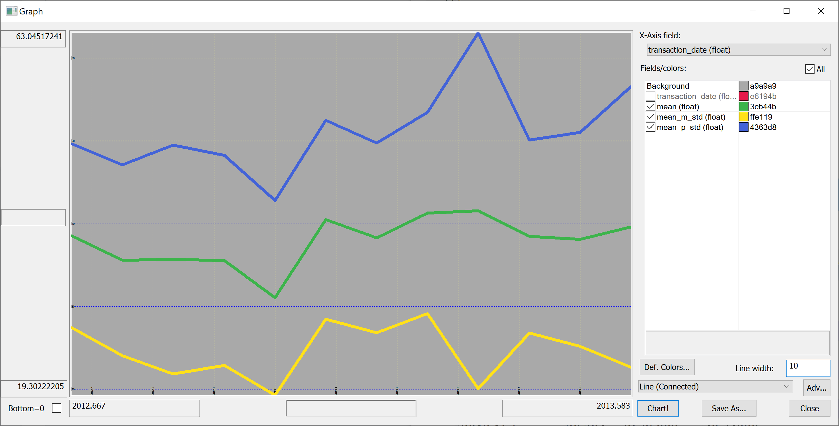
Looking at this plot, it appears that the house prices dropped towards the start of 2013 and then sharply increased again. However, we don't know the uncertainties. We could produce a plot of the mean house prices in any given month +/- one standard deviation:
select transaction_date,mean,mean_m_std:mean-std,mean_p_std:mean+std from
  select mean:avg house_price_per_unit_area,std:sqrt var house_price_per_unit_area by transaction_date from t
Perhaps we shouldn't jump to conclusions regarding the increase / decrease of the house prices over time: the standard deviation is quite high.
Histograms
In order to better understand the data we need to plot some histograms. We define the following function:
getHistogram:{[data;rule]
  / data - array of data
  / rule - function which takes data and returns bins
  bins: rule data;
  update 0^histogram from
    ([bins:asc til count[bins]] x:bins) uj
    (select histogram: count bins by bins from ([] bins:bins binr data))};
This function takes as a parameter a rule — a function that takes the data and returns the bins. We'll use a very simple rule:
histBin:{[n;data]
    / n - number of bins
    / data - array of data
    min[data]+((max[data]-min[data])%n)*til 1+n};
More advanced rules can be found in the library quantQ: https://github.com/hanssmail/quantQ
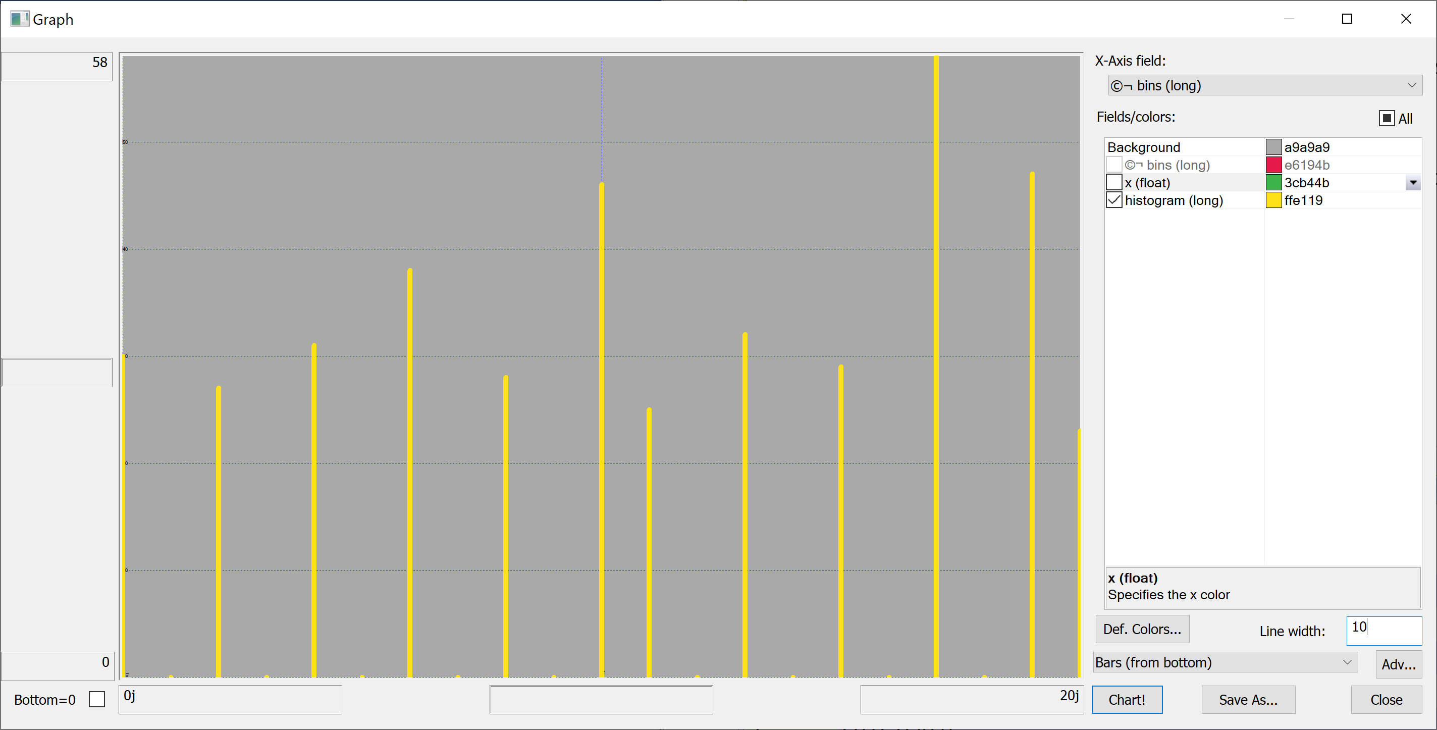
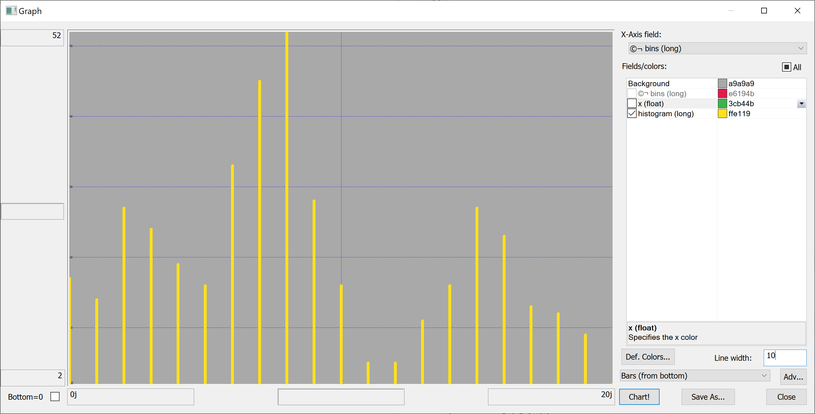
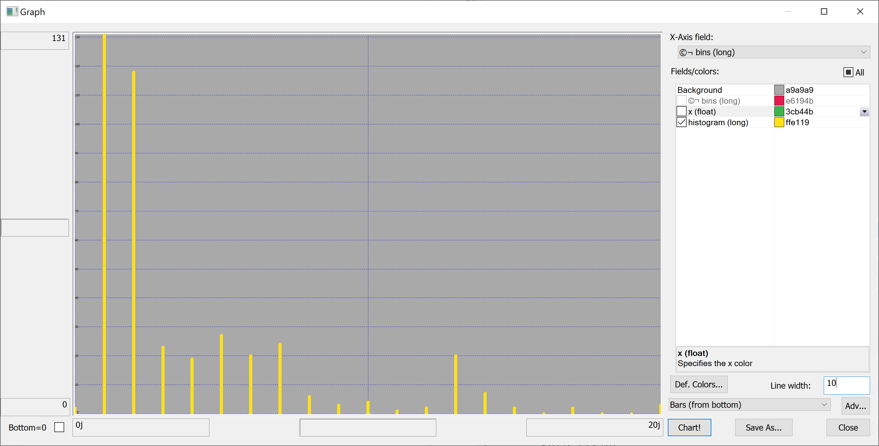
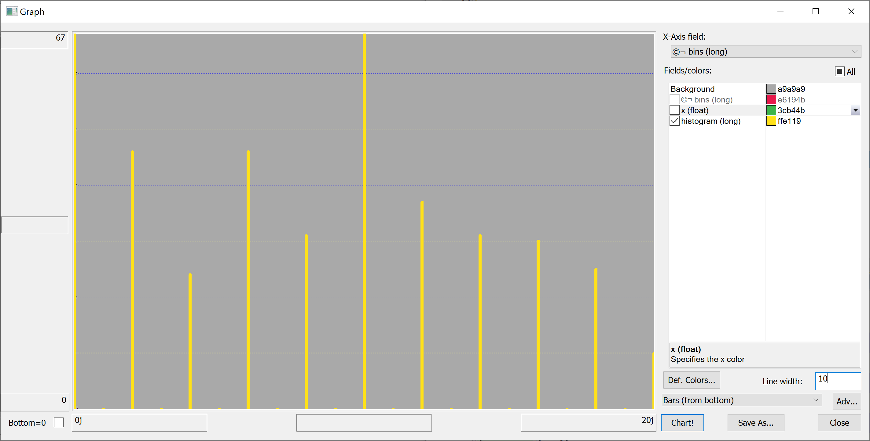
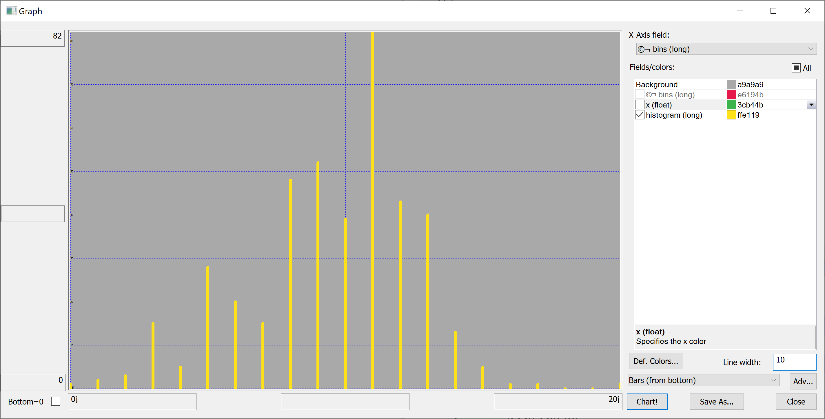
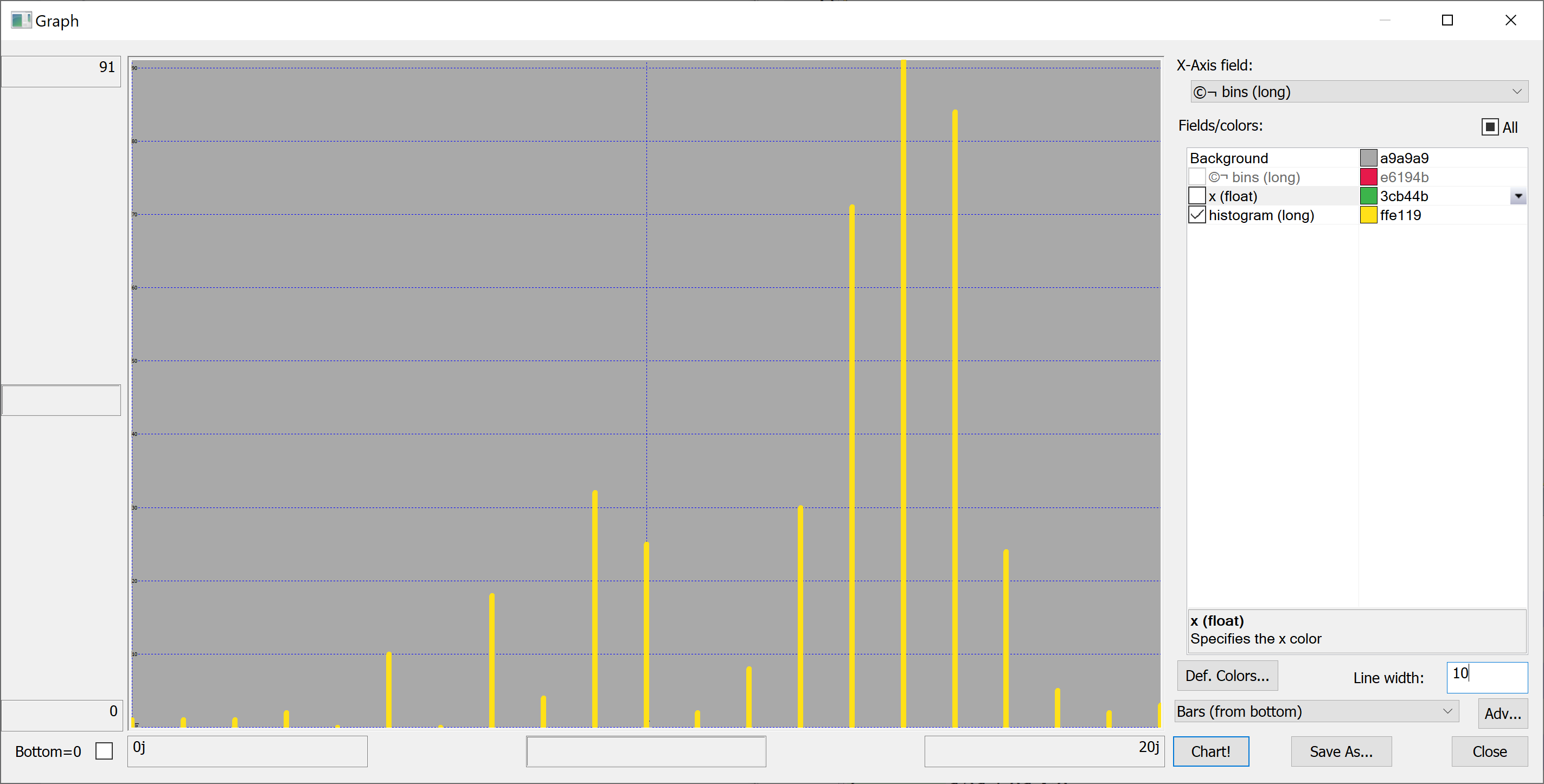
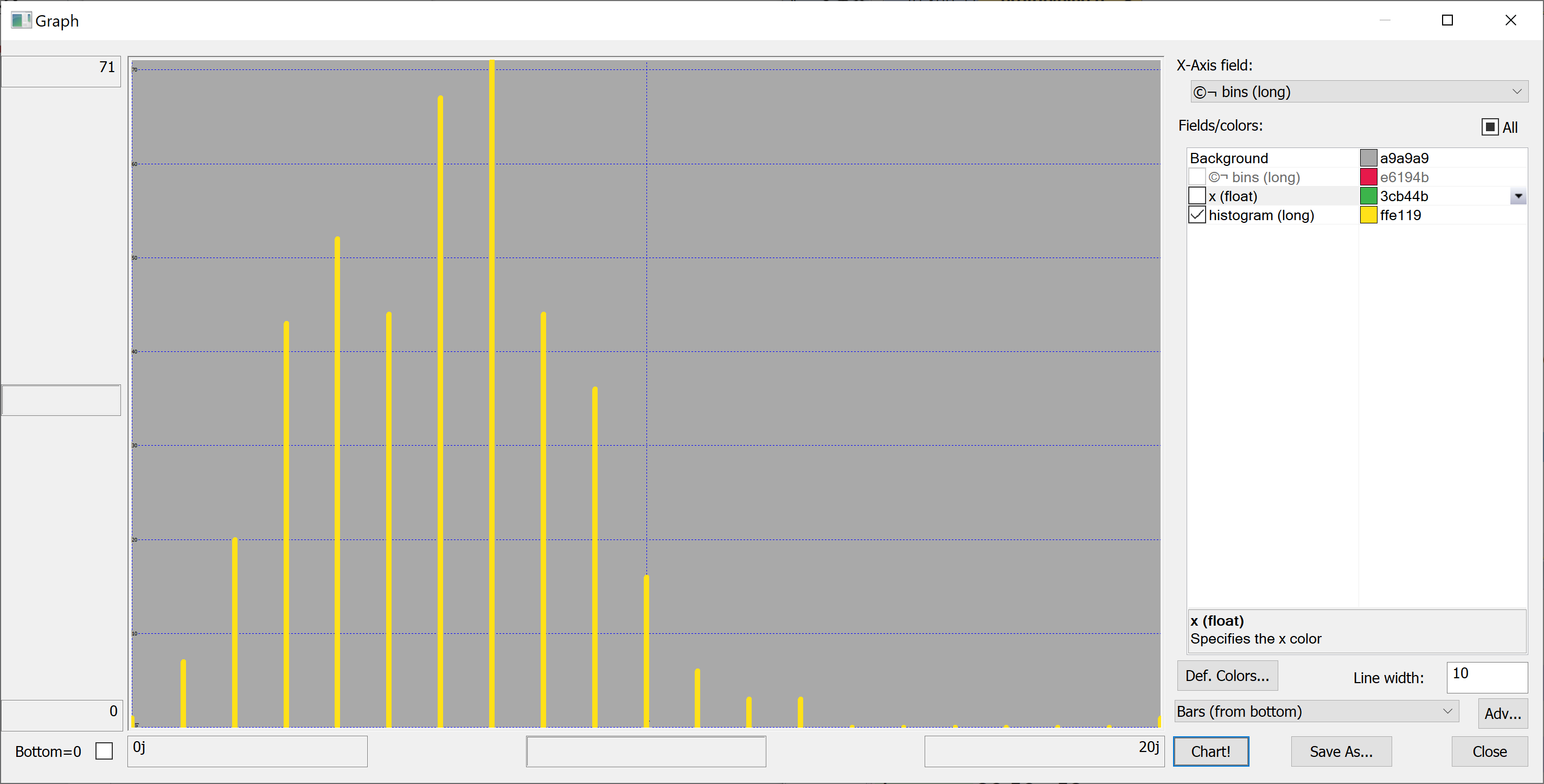
Equipped with this code, we can plot the histograms:
getHistogram[t[`transaction_date];histBin[20]]
getHistogram[t[`house_age];histBin[20]]
getHistogram[t[`distance_to_nearest_mrt];histBin[20]]
getHistogram[`float$t[`number_of_convenience_stores];histBin[20]]
getHistogram[t[`latitude];histBin[20]]
getHistogram[t[`longitude];histBin[20]]
getHistogram[t[`house_price_per_unit_area];histBin[20]]
A map
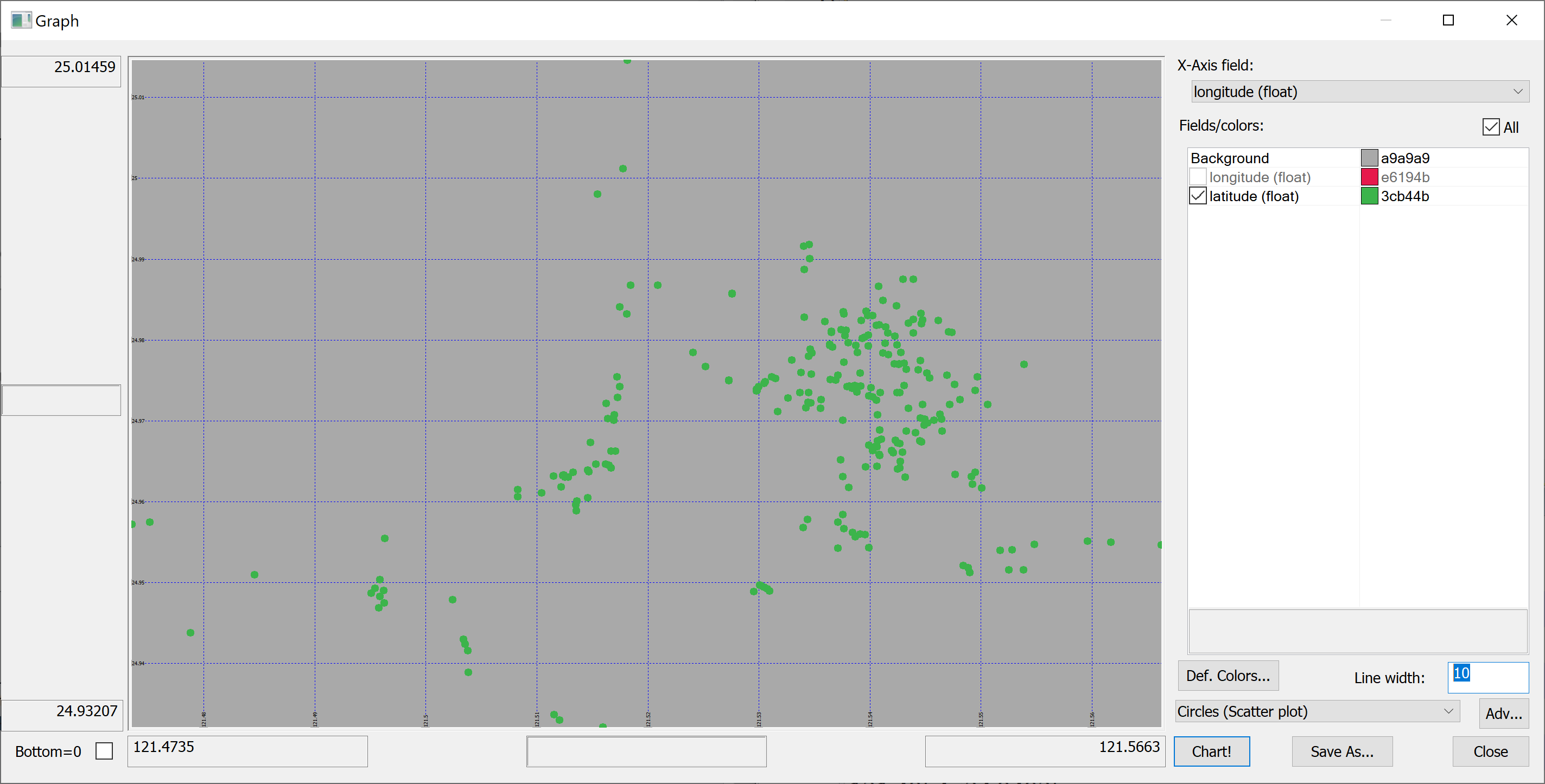
Since we have columns containing the longitude and latitude of each property, we can produce a map of all properties in the data set:
select longitude,latitude from t
Scatter plots
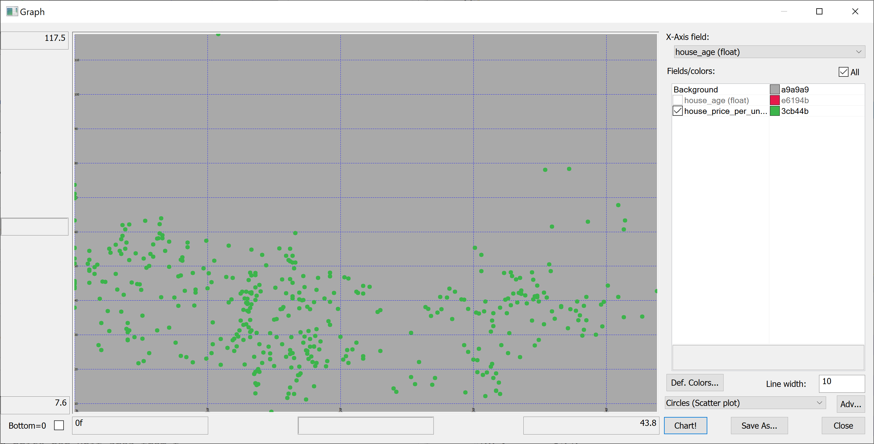
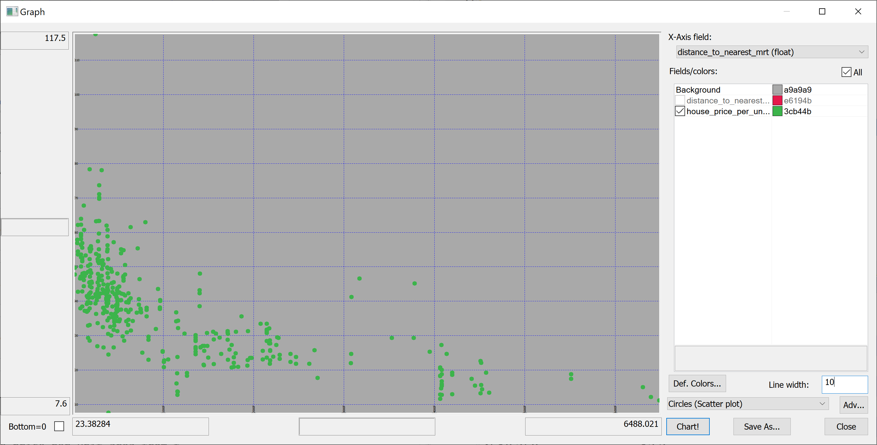
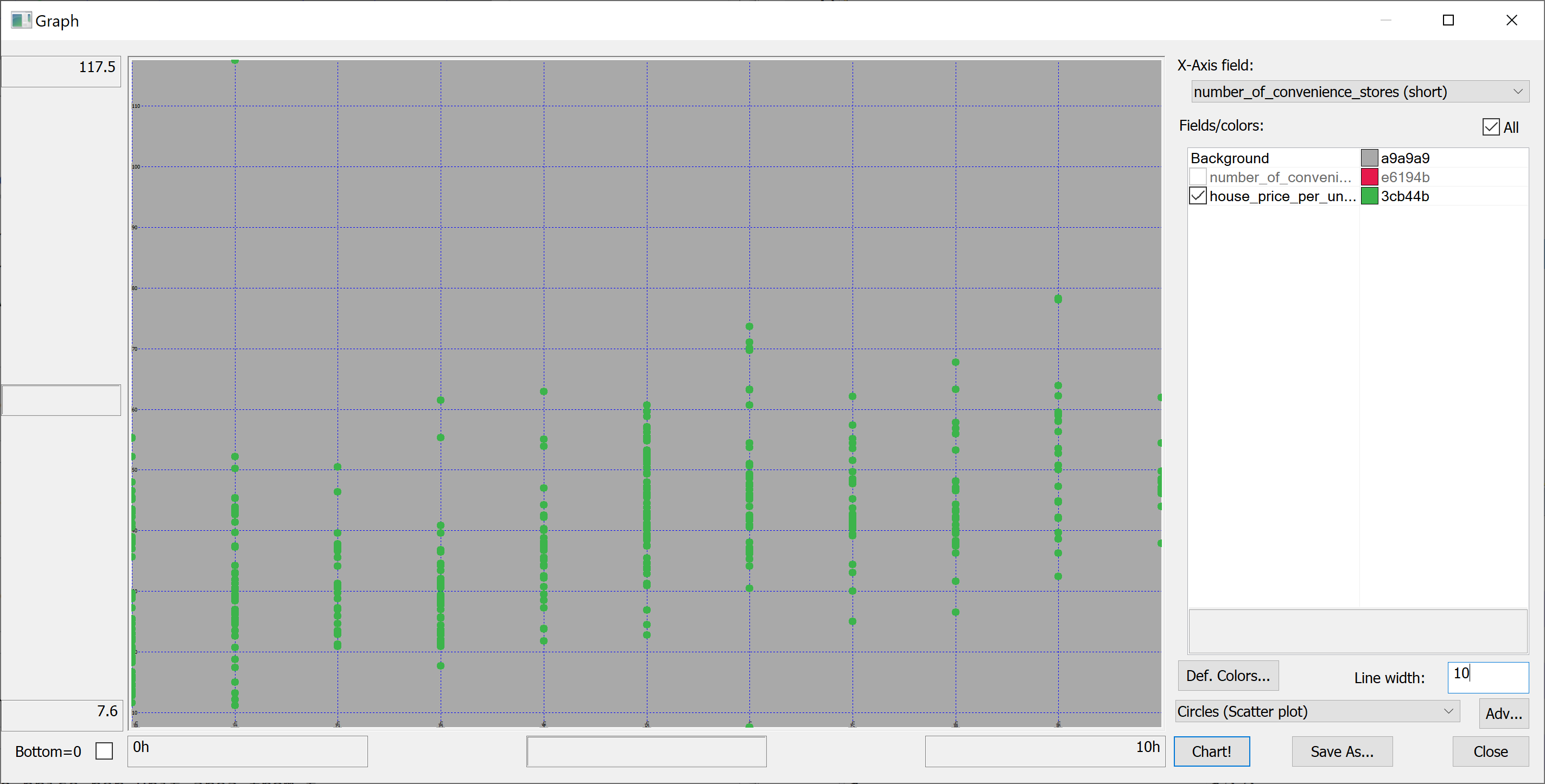
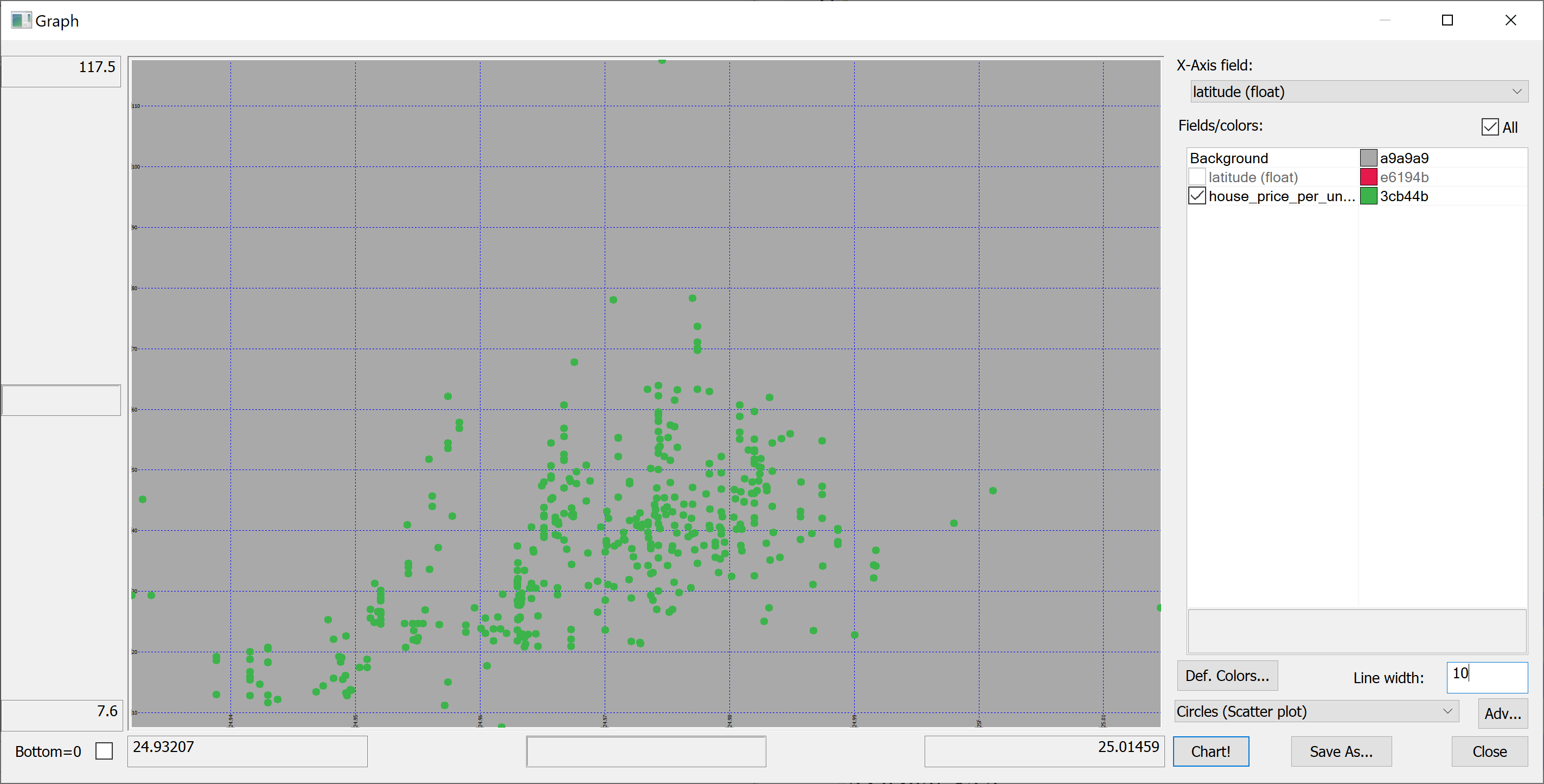
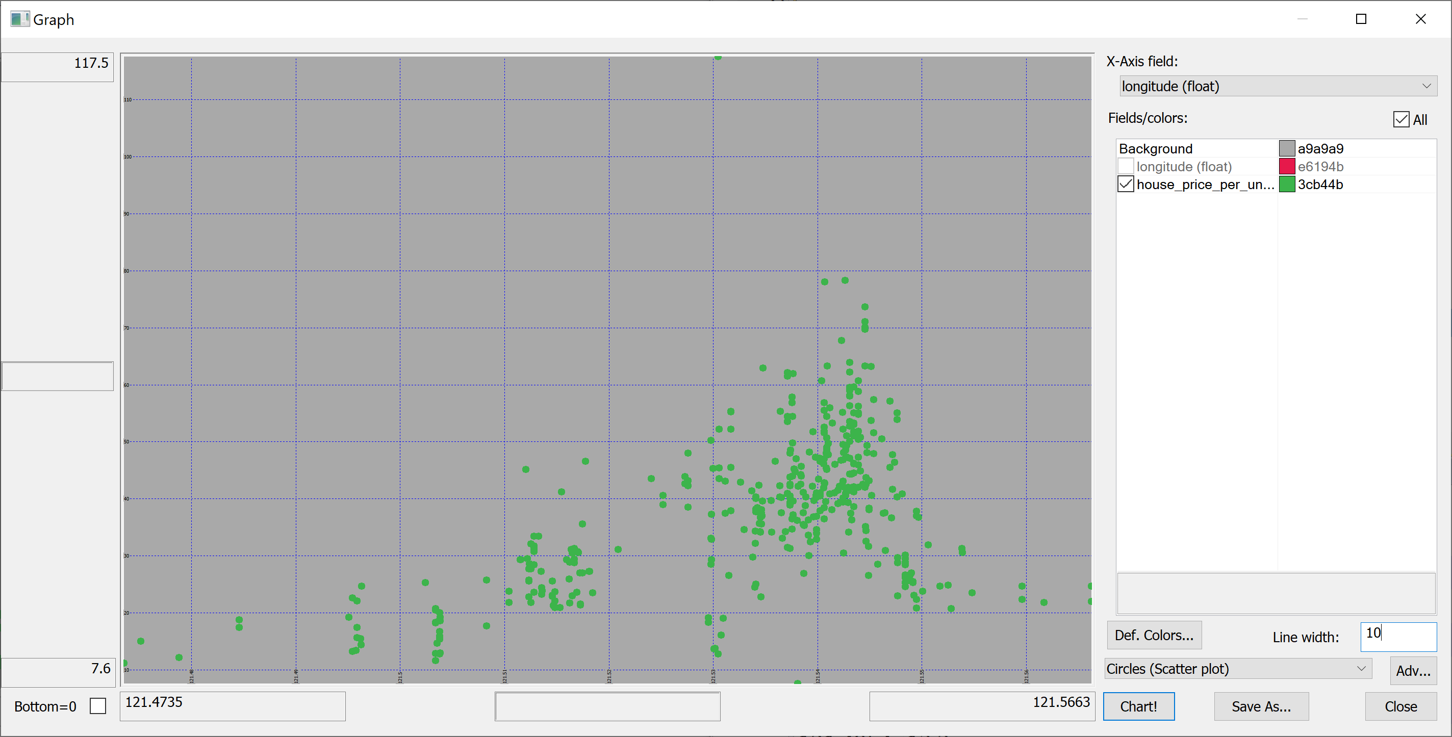
We are interested in predicting the house_price_per_unit_area using the various features present in our data set. Before we apply a machine learning algorithm, it is prudent to produce some scatter plots. The scatter plots could indicate whether each feature individually could help explain the house_price_per_unit_area.
select house_age,house_price_per_unit_area from t
select distance_to_nearest_mrt,house_price_per_unit_area from t
select number_of_convenience_stores,house_price_per_unit_area from t
select latitude,house_price_per_unit_area from t
select longitude,house_price_per_unit_area from t
Splitting the data
We are going to introduce some pseudorandomness, so it's a good idea to fix the seed to ensure reproducibility.
This can be done using the \S system command:
\S 42
We can now pseudorandomly shuffle the data:
n:count t;
t:neg[n]?t;
Let us use half of the data set as the training set and the other half as the test set:
n_train:n div 2;
n_test:n-n_train;

t_train:n_train#t;
t_test:neg[n_test]#t;
t_train and t_test are tables; we need matrices:
x_train:flip`float$t_train[-1_2_cols t_train];
y_train:raze t_train[-1#cols t_train];

x_test:flip`float$t_test[-1_2_cols t_test];
y_test:raze t_test[-1#cols t_test];
Linear regression using OLS
Suppose the data consists of Failed to parse (MathML with SVG or PNG fallback (recommended for modern browsers and accessibility tools): Invalid response ("Math extension cannot connect to Restbase.") from server "https://wikimedia.org/api/rest_v1/":): {\displaystyle n} observations . Each observation Failed to parse (MathML with SVG or PNG fallback (recommended for modern browsers and accessibility tools): Invalid response ("Math extension cannot connect to Restbase.") from server "https://wikimedia.org/api/rest_v1/":): {\displaystyle i} includes a scalar response Failed to parse (MathML with SVG or PNG fallback (recommended for modern browsers and accessibility tools): Invalid response ("Math extension cannot connect to Restbase.") from server "https://wikimedia.org/api/rest_v1/":): {\displaystyle y_i} and a column vector Failed to parse (MathML with SVG or PNG fallback (recommended for modern browsers and accessibility tools): Invalid response ("Math extension cannot connect to Restbase.") from server "https://wikimedia.org/api/rest_v1/":): {\displaystyle \mathbf{x}_i} of Failed to parse (MathML with SVG or PNG fallback (recommended for modern browsers and accessibility tools): Invalid response ("Math extension cannot connect to Restbase.") from server "https://wikimedia.org/api/rest_v1/":): {\displaystyle p} regressors, i.e.
In general, Failed to parse (MathML with SVG or PNG fallback (recommended for modern browsers and accessibility tools): Invalid response ("Math extension cannot connect to Restbase.") from server "https://wikimedia.org/api/rest_v1/":): {\displaystyle n > p} . In a linear regression model, the response variable Failed to parse (MathML with SVG or PNG fallback (recommended for modern browsers and accessibility tools): Invalid response ("Math extension cannot connect to Restbase.") from server "https://wikimedia.org/api/rest_v1/":): {\displaystyle y_i} is a linear function of the regressors:
or in vector form,
where Failed to parse (MathML with SVG or PNG fallback (recommended for modern browsers and accessibility tools): Invalid response ("Math extension cannot connect to Restbase.") from server "https://wikimedia.org/api/rest_v1/":): {\displaystyle \mathbf{x}_i} , as introduced previously, is a column vector of the Failed to parse (MathML with SVG or PNG fallback (recommended for modern browsers and accessibility tools): Invalid response ("Math extension cannot connect to Restbase.") from server "https://wikimedia.org/api/rest_v1/":): {\displaystyle i} th observation of all the explanatory variables; Failed to parse (MathML with SVG or PNG fallback (recommended for modern browsers and accessibility tools): Invalid response ("Math extension cannot connect to Restbase.") from server "https://wikimedia.org/api/rest_v1/":): {\displaystyle \mathbf{\beta}} is a Failed to parse (MathML with SVG or PNG fallback (recommended for modern browsers and accessibility tools): Invalid response ("Math extension cannot connect to Restbase.") from server "https://wikimedia.org/api/rest_v1/":): {\displaystyle p \times 1} vector of unknown parameters; and the scalar Failed to parse (MathML with SVG or PNG fallback (recommended for modern browsers and accessibility tools): Invalid response ("Math extension cannot connect to Restbase.") from server "https://wikimedia.org/api/rest_v1/":): {\displaystyle \epsilon_i} represents unobserved random variables (errors) of the Failed to parse (MathML with SVG or PNG fallback (recommended for modern browsers and accessibility tools): Invalid response ("Math extension cannot connect to Restbase.") from server "https://wikimedia.org/api/rest_v1/":): {\displaystyle i} th observation. Failed to parse (MathML with SVG or PNG fallback (recommended for modern browsers and accessibility tools): Invalid response ("Math extension cannot connect to Restbase.") from server "https://wikimedia.org/api/rest_v1/":): {\displaystyle \epsilon_i} accounts for the influences upon the responses Failed to parse (MathML with SVG or PNG fallback (recommended for modern browsers and accessibility tools): Invalid response ("Math extension cannot connect to Restbase.") from server "https://wikimedia.org/api/rest_v1/":): {\displaystyle y_i} from sources other than the regressors Failed to parse (MathML with SVG or PNG fallback (recommended for modern browsers and accessibility tools): Invalid response ("Math extension cannot connect to Restbase.") from server "https://wikimedia.org/api/rest_v1/":): {\displaystyle \mathbf{x}_i} . This model can also be written in matrix notation as
where Failed to parse (MathML with SVG or PNG fallback (recommended for modern browsers and accessibility tools): Invalid response ("Math extension cannot connect to Restbase.") from server "https://wikimedia.org/api/rest_v1/":): {\displaystyle \mathbf{y}} and Failed to parse (MathML with SVG or PNG fallback (recommended for modern browsers and accessibility tools): Invalid response ("Math extension cannot connect to Restbase.") from server "https://wikimedia.org/api/rest_v1/":): {\displaystyle \mathbf{\epsilon}} are Failed to parse (MathML with SVG or PNG fallback (recommended for modern browsers and accessibility tools): Invalid response ("Math extension cannot connect to Restbase.") from server "https://wikimedia.org/api/rest_v1/":): {\displaystyle n \times 1} vectors of the response variables and the errors of the Failed to parse (MathML with SVG or PNG fallback (recommended for modern browsers and accessibility tools): Invalid response ("Math extension cannot connect to Restbase.") from server "https://wikimedia.org/api/rest_v1/":): {\displaystyle n} observations, and Failed to parse (MathML with SVG or PNG fallback (recommended for modern browsers and accessibility tools): Invalid response ("Math extension cannot connect to Restbase.") from server "https://wikimedia.org/api/rest_v1/":): {\displaystyle \mathbf{X}} is an Failed to parse (MathML with SVG or PNG fallback (recommended for modern browsers and accessibility tools): Invalid response ("Math extension cannot connect to Restbase.") from server "https://wikimedia.org/api/rest_v1/":): {\displaystyle n \times p} matrix of regressors, also sometimes called the design matrix, whose row Failed to parse (MathML with SVG or PNG fallback (recommended for modern browsers and accessibility tools): Invalid response ("Math extension cannot connect to Restbase.") from server "https://wikimedia.org/api/rest_v1/":): {\displaystyle i} is Failed to parse (MathML with SVG or PNG fallback (recommended for modern browsers and accessibility tools): Invalid response ("Math extension cannot connect to Restbase.") from server "https://wikimedia.org/api/rest_v1/":): {\displaystyle \mathbf{x}_i^{\intercal}} and contains the Failed to parse (MathML with SVG or PNG fallback (recommended for modern browsers and accessibility tools): Invalid response ("Math extension cannot connect to Restbase.") from server "https://wikimedia.org/api/rest_v1/":): {\displaystyle i} th observations of all the explanatory variables.
How do we find the coefficients Failed to parse (MathML with SVG or PNG fallback (recommended for modern browsers and accessibility tools): Invalid response ("Math extension cannot connect to Restbase.") from server "https://wikimedia.org/api/rest_v1/":): {\displaystyle \mathbf{\beta}} ?
Consider the overdetermined system
Such a system usually has no exact solution, so the goal is instead to find the coefficient Failed to parse (MathML with SVG or PNG fallback (recommended for modern browsers and accessibility tools): Invalid response ("Math extension cannot connect to Restbase.") from server "https://wikimedia.org/api/rest_v1/":): {\displaystyle \mathbf{\beta}} which fit the equations "best". In ordinary least squares (OLS) this "best" is taken in the sense of solving the quadratic minimization problem
This minimization problem has a unique solution, provided that the Failed to parse (MathML with SVG or PNG fallback (recommended for modern browsers and accessibility tools): Invalid response ("Math extension cannot connect to Restbase.") from server "https://wikimedia.org/api/rest_v1/":): {\displaystyle p} columns of the matrix Failed to parse (MathML with SVG or PNG fallback (recommended for modern browsers and accessibility tools): Invalid response ("Math extension cannot connect to Restbase.") from server "https://wikimedia.org/api/rest_v1/":): {\displaystyle X} are linearly independent, given by solving the normal equations
The matrix Failed to parse (MathML with SVG or PNG fallback (recommended for modern browsers and accessibility tools): Invalid response ("Math extension cannot connect to Restbase.") from server "https://wikimedia.org/api/rest_v1/":): {\displaystyle \mathbf{X}^{\intercal} \mathbf{X}} is known as the normal matrix and the matrix Failed to parse (MathML with SVG or PNG fallback (recommended for modern browsers and accessibility tools): Invalid response ("Math extension cannot connect to Restbase.") from server "https://wikimedia.org/api/rest_v1/":): {\displaystyle \mathbf{X}^{\intercal} \mathbf{y}} as the moment matrix of regressand by regressors. Finally, Failed to parse (MathML with SVG or PNG fallback (recommended for modern browsers and accessibility tools): Invalid response ("Math extension cannot connect to Restbase.") from server "https://wikimedia.org/api/rest_v1/":): {\displaystyle \hat{\mathbf{\beta}}} is the coefficient vector of the least-squares hyperplane, expressed as
After we have estimated Failed to parse (MathML with SVG or PNG fallback (recommended for modern browsers and accessibility tools): Invalid response ("Math extension cannot connect to Restbase.") from server "https://wikimedia.org/api/rest_v1/":): {\displaystyle \mathbf{\beta}} , the fitted values (or predicted values) from the regression will be Failed to parse (MathML with SVG or PNG fallback (recommended for modern browsers and accessibility tools): Invalid response ("Math extension cannot connect to Restbase.") from server "https://wikimedia.org/api/rest_v1/":): {\displaystyle \hat{\mathbf{y}} = \mathbf{X}\hat{\mathbf{\beta}}. }
Let us implement OLS in q:
ols_fit:{[x;y]
  ytx:enlist[y]mmu x;
  xtx:flip[x]mmu x;
  solution:ytx lsq xtx;
  beta:first solution;
  (enlist`beta)!enlist beta};

ols_predict:{[solution;x]
  sum solution[`beta]*flip x};
lsq solves normal equations matrix via Cholesky decomposition; this is more robust than a combination of matrix inversion and multiplication.
Define the residuals as
(forming a vector Failed to parse (MathML with SVG or PNG fallback (recommended for modern browsers and accessibility tools): Invalid response ("Math extension cannot connect to Restbase.") from server "https://wikimedia.org/api/rest_v1/":): {\displaystyle \mathbf{e}} ).
Let
be the mean of the observed data.
The variability of the data set can be measured with two sums of squares:
- the total sum of squares (TSS) (proportional to the variance of the data):
- the sum of squares of the residuals, also called the residual sum of squares (RSS):
It is common to assess the goodness-of-fit of the OLS regression by comparing how much the initial variation in the sample can be reduced by regressing onto Failed to parse (MathML with SVG or PNG fallback (recommended for modern browsers and accessibility tools): Invalid response ("Math extension cannot connect to Restbase.") from server "https://wikimedia.org/api/rest_v1/":): {\displaystyle \mathbf{X}} . The coefficient of determination Failed to parse (MathML with SVG or PNG fallback (recommended for modern browsers and accessibility tools): Invalid response ("Math extension cannot connect to Restbase.") from server "https://wikimedia.org/api/rest_v1/":): {\displaystyle R^2} is defined as a ratio of "explained" variance to the "total" variance of the dependent variable :
In the best case, the modelled values exactly match the observed values, which results in Failed to parse (MathML with SVG or PNG fallback (recommended for modern browsers and accessibility tools): Invalid response ("Math extension cannot connect to Restbase.") from server "https://wikimedia.org/api/rest_v1/":): {\displaystyle \text{TSS} = 0} and Failed to parse (MathML with SVG or PNG fallback (recommended for modern browsers and accessibility tools): Invalid response ("Math extension cannot connect to Restbase.") from server "https://wikimedia.org/api/rest_v1/":): {\displaystyle R^2 = 1} . A baseline model, which always predicts Failed to parse (MathML with SVG or PNG fallback (recommended for modern browsers and accessibility tools): Invalid response ("Math extension cannot connect to Restbase.") from server "https://wikimedia.org/api/rest_v1/":): {\displaystyle \bar{y}} , will have Failed to parse (MathML with SVG or PNG fallback (recommended for modern browsers and accessibility tools): Invalid response ("Math extension cannot connect to Restbase.") from server "https://wikimedia.org/api/rest_v1/":): {\displaystyle R^2 = 0} . Models that have worse predictions than this baseline will have a negative Failed to parse (MathML with SVG or PNG fallback (recommended for modern browsers and accessibility tools): Invalid response ("Math extension cannot connect to Restbase.") from server "https://wikimedia.org/api/rest_v1/":): {\displaystyle R^2} .
Let us implement Failed to parse (MathML with SVG or PNG fallback (recommended for modern browsers and accessibility tools): Invalid response ("Math extension cannot connect to Restbase.") from server "https://wikimedia.org/api/rest_v1/":): {\displaystyle R^2} in q:
r_squared:{[y;y_pred]
  tss:sum t*t:y-avg[y];
  rss:sum t*t:y-y_pred;
  (tss-rss)%tss};
Applying the OLS linear regression to our data set
We apply the OLS linear regression to our data set as follows:
model:ols_fit[x_train;y_train];
y_train_pred:ols_predict[model;x_train];
We obtain the in-sample Failed to parse (MathML with SVG or PNG fallback (recommended for modern browsers and accessibility tools): Invalid response ("Math extension cannot connect to Restbase.") from server "https://wikimedia.org/api/rest_v1/":): {\displaystyle R^2} of 0.4859935 (approx. 49%):
r_squared[y_train;y_train_pred]
How well are we doing out-of-sample? Surprisingly, better than in-sample:
y_test_pred:ols_predict[model;x_test];
r_squared[y_test;y_test_pred]
The resulting Failed to parse (MathML with SVG or PNG fallback (recommended for modern browsers and accessibility tools): Invalid response ("Math extension cannot connect to Restbase.") from server "https://wikimedia.org/api/rest_v1/":): {\displaystyle R^2} is 0.5986606 (approx. 60%).
It is unusual for the out-of-sample Failed to parse (MathML with SVG or PNG fallback (recommended for modern browsers and accessibility tools): Invalid response ("Math extension cannot connect to Restbase.") from server "https://wikimedia.org/api/rest_v1/":): {\displaystyle R^2} to be better than the in-sample Failed to parse (MathML with SVG or PNG fallback (recommended for modern browsers and accessibility tools): Invalid response ("Math extension cannot connect to Restbase.") from server "https://wikimedia.org/api/rest_v1/":): {\displaystyle R^2} , but it may occasionally happen. Why did this happen in our case?
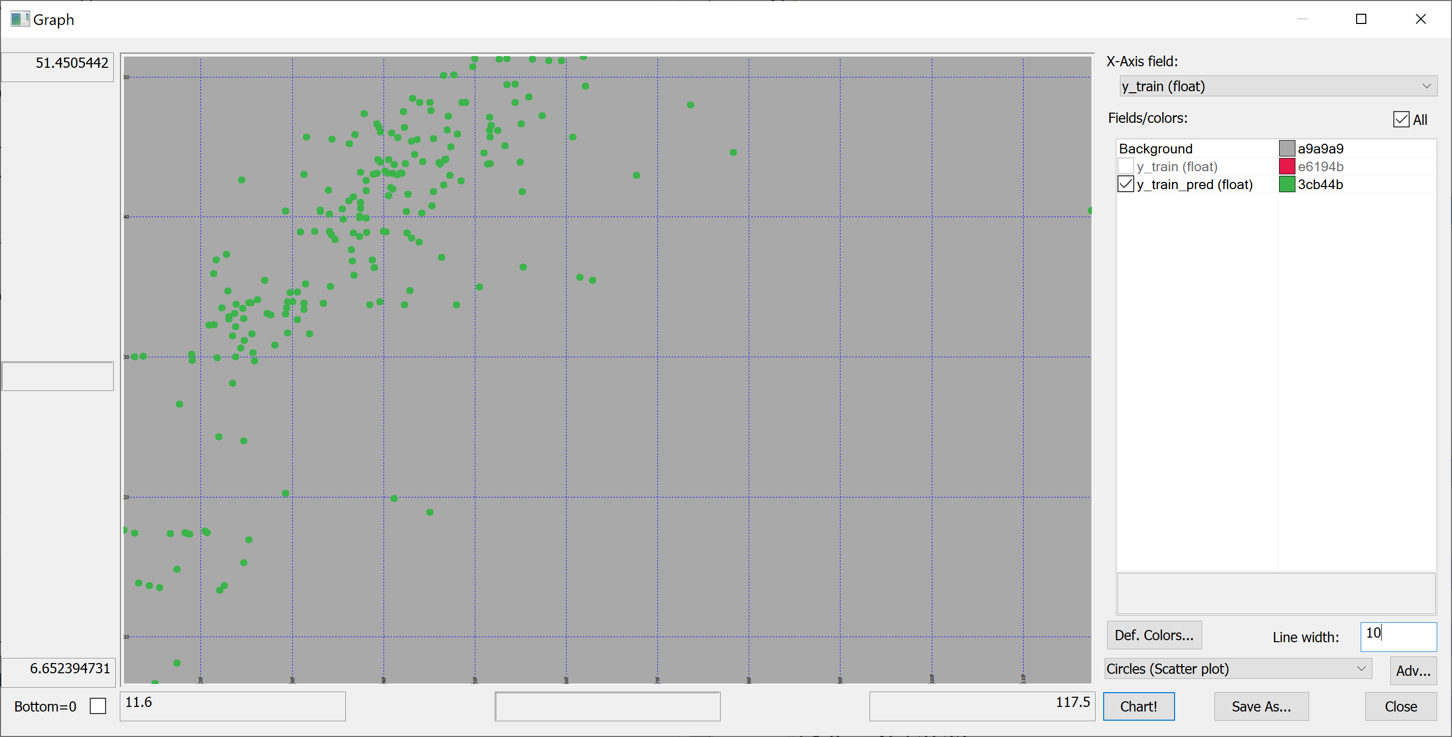
The answer is revealed by the scatter-plots.
In-sample:
flip `y_train`y_train_pred!(y_train;y_train_pred)
Out-of-sample:
flip `y_test`y_test_pred!(y_test;y_test_pred)
On the in-sample scatter plot we see the outlier (the rightmost point on the plot). This outlier is likely affecting the in-sample Failed to parse (MathML with SVG or PNG fallback (recommended for modern browsers and accessibility tools): Invalid response ("Math extension cannot connect to Restbase.") from server "https://wikimedia.org/api/rest_v1/":): {\displaystyle R^2} . Let's find this outlier:
select from t_train where (max abs y_train_pred-y_train)=abs y_train_pred-y_train
no  transaction_date house_age distance_to_nearest_mrt number_of_convenience_stores latitude longitude house_price_per_unit_area
--------------------------------------------------------------------------------------------------------------------------------
271 2013.333         10.8      252.5822                1                            24.9746  121.5305  117.5
This outlier corresponds to a property with an unusually high house_price_per_unit_area. We can even find this property on Google Maps (by entering the latitude and longitude).
Let's remove this outlier:
delete from `t_train where (max abs y_train_pred-y_train)=abs y_train_pred-y_train;
x_train:flip`float$t_train[-1_2_cols t_train];
y_train:raze t_train[-1#cols t_train];
Now let's repeat the fitting procedure:
model:ols_fit[x_train;y_train];
y_train_pred:ols_predict[model;x_train];

r_squared[y_train;y_train_pred]
Now we obtain the in-sample Failed to parse (MathML with SVG or PNG fallback (recommended for modern browsers and accessibility tools): Invalid response ("Math extension cannot connect to Restbase.") from server "https://wikimedia.org/api/rest_v1/":): {\displaystyle R^2} of 0.5706795 (approx. 57%). What about out-of-sample?
y_test_pred:ols_predict[model;x_test];
r_squared[y_test;y_test_pred]
0.5941468 (approx. 59%). Still (somewhat surprisingly) greater than in-sample, but much closer.
Combining q and Python: improving on OLS
Can we do better than that?
For some things q is perfect (e.g. working with big data), whereas others are best reserved for Python (and especially its excellent machine learning libraries). We'll now use Python to improve on the results of the OLS regression.
We'll use the qpython module to interact with q from Python. We install it using
pip install qpython
XGBoost is advertised as
an optimized distributed gradient boosting library designed to be highly efficient, flexible and portable. It implements machine learning algorithms under the Gradient Boosting framework. XGBoost provides a parallel tree boosting (also known as GBDT, GBM) that solve many data science problems in a fast and accurate way. The same code runs on major distributed environment (Hadoop, SGE, MPI) and can solve problems beyond billions of examples.
Wikipedia tells us that gradient boosting
is a machine learning technique for regression, classification and other tasks, which produces a prediction model in the form of an ensemble of weak prediction models, typically decision trees. When a decision tree is the weak learning, the resulting algorithm is called gradient boosted trees, which usually outperforms random forest. It builds the model in a stage-wise fashion like other boosting methods do, and it generalizes them by allowing optimization of an arbitrary differentiable loss function.
Let's install XGBoost:
pip install xgboost
We start a Jupyter notebook and import the following Python modules:
import numpy as np
import qpython.qconnection
import sklearn.metrics
import xgboost
We want Python to be able to talk to kdb+/q. To this end, in q, we open a port:
\p 41822
We connect to this port from the Python side:
q = qpython.qconnection.QConnection('localhost', 41822, pandas=True)
q.open()
We fetch the data set from q to Python:
x_train = np.array(q('x_train'))
y_train = np.array(q('y_train'))
x_test = np.array(q('x_test'))
y_test = np.array(q('y_test'))
We then create an XGBoost model with default parameters (let's see how well XGBoost works out of the box):
model = xgboost.XGBRegressor()
and fit this model to the data:
model.fit(x_train, y_train)
The model is then used to obtain the predictions y_train_pred:
y_train_pred = model.predict(x_train)
How good is the fit? What is our in-sample Failed to parse (MathML with SVG or PNG fallback (recommended for modern browsers and accessibility tools): Invalid response ("Math extension cannot connect to Restbase.") from server "https://wikimedia.org/api/rest_v1/":): {\displaystyle R^2} ?
sklearn.metrics.r2_score(y_train, y_train_pred)
The result is
0.9955447127025048
Of course, we are interested in the out-of-sample, rather than in-sample, performance of the model. Let's apply the model to the test set:
y_test_pred = model.predict(x_test)
What's our out out-of-sample Failed to parse (MathML with SVG or PNG fallback (recommended for modern browsers and accessibility tools): Invalid response ("Math extension cannot connect to Restbase.") from server "https://wikimedia.org/api/rest_v1/":): {\displaystyle R^2} ?
sklearn.metrics.r2_score(y_test, y_test_pred)
0.7187695555297899
The out-of-sample Failed to parse (MathML with SVG or PNG fallback (recommended for modern browsers and accessibility tools): Invalid response ("Math extension cannot connect to Restbase.") from server "https://wikimedia.org/api/rest_v1/":): {\displaystyle R^2} of about 72% is significantly better than that produced using the OLS regression.
